Empowering Patients:
An Integrated Platform Case Study
Persona
A persona named Audrey was created, representing a pregnant woman and her pain points. Audrey embodies the needs and characteristics of our target audience. She was the guide in developing solutions, designing features, and refining concepts.
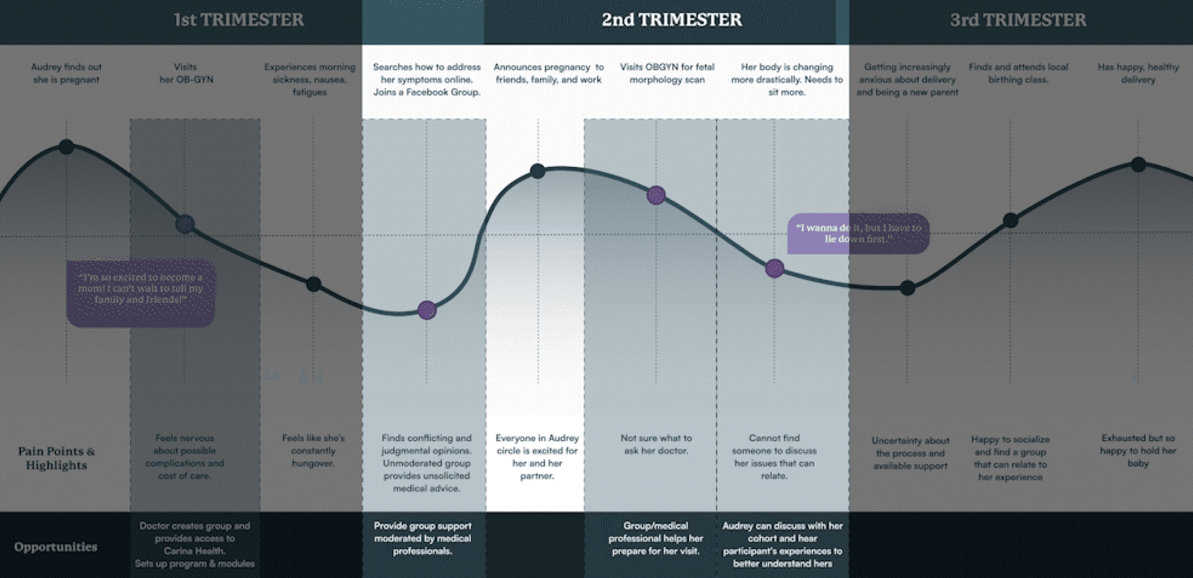
Journey Map
A journey map was developed to understand Audrey's experiences and struggles during her pregnancy. This helps improve solutions to better meet her needs as an expectant mother.
Reframed Challenge
Following the research phase, a revised problem statement was crafted to better reflect the insights gathered and ensure it accurately addresses the identified challenges.
Insights to Features
Turning insights into features meant using the collected data to create functionalities that met the user needs. Ultimately this will improve the overall experience driving product innovation.
Mid-Fidelity Wireframes
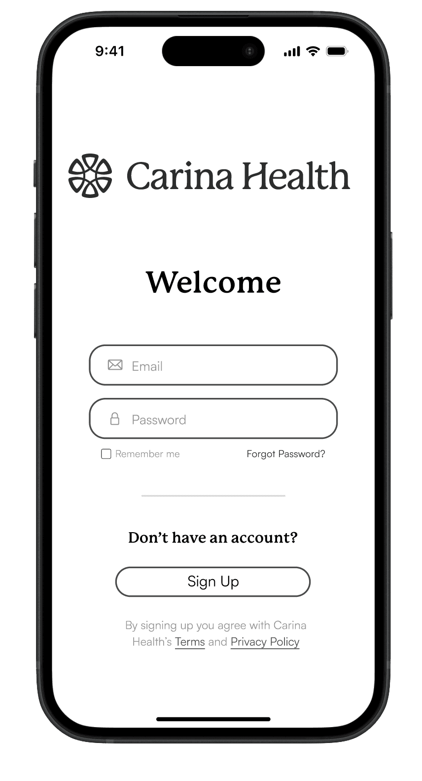
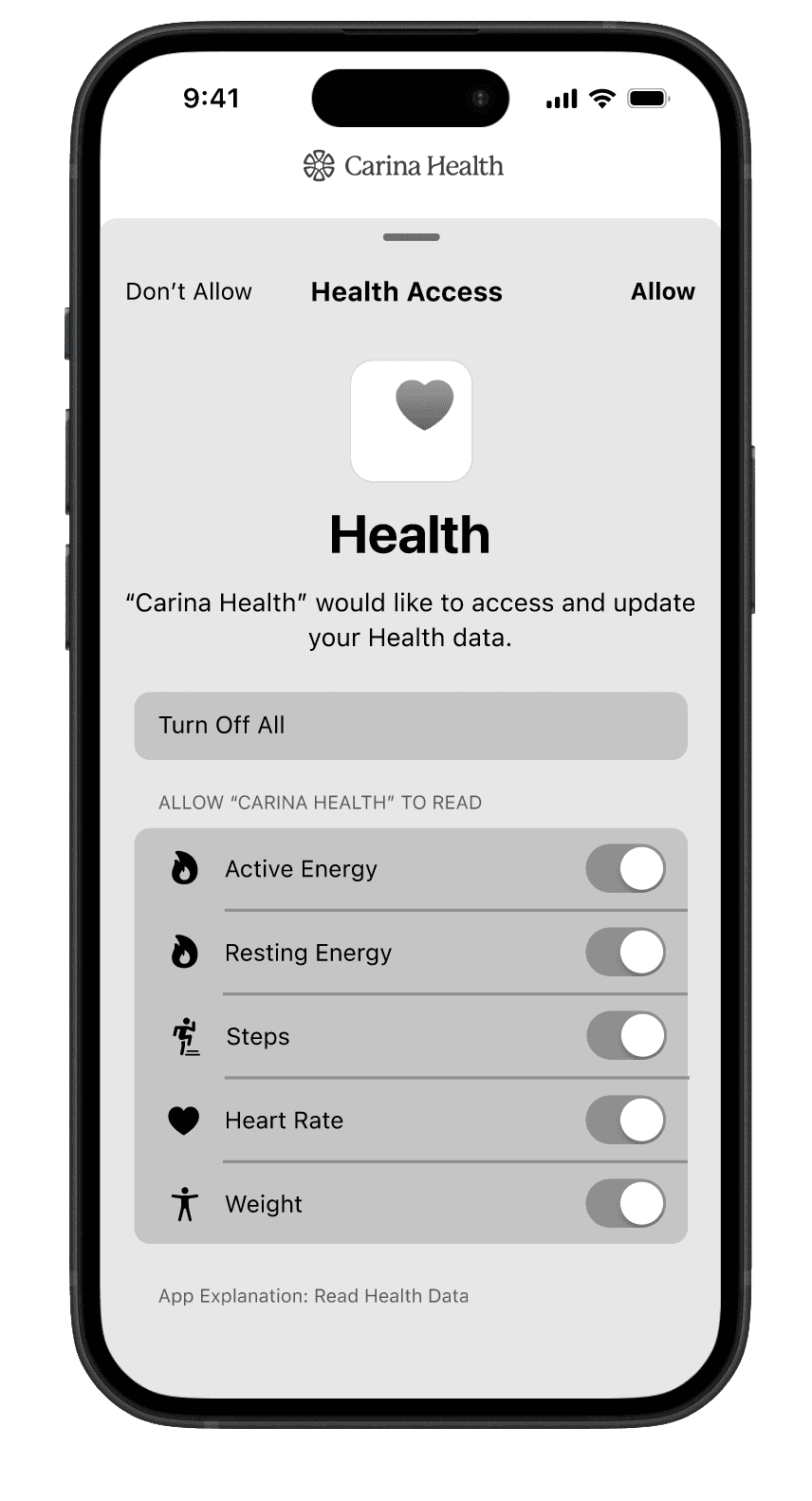
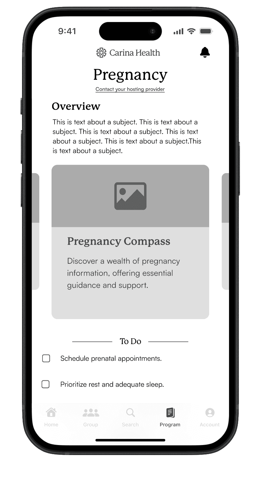
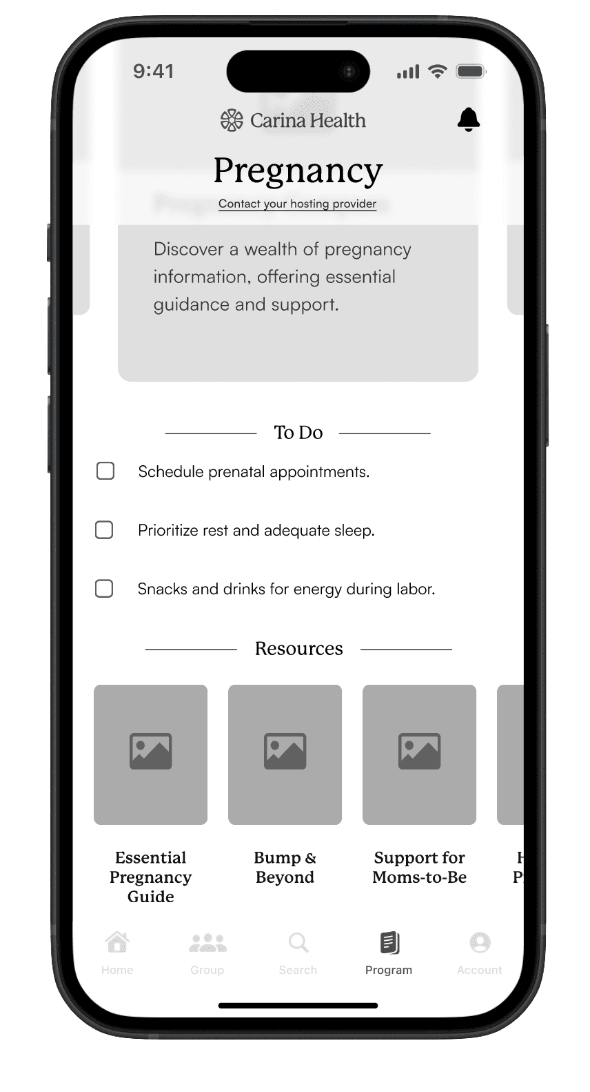
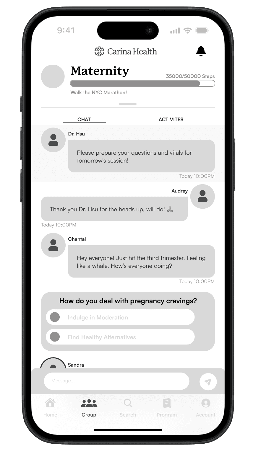
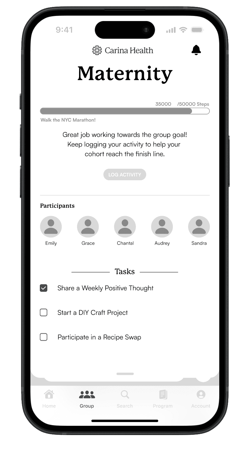
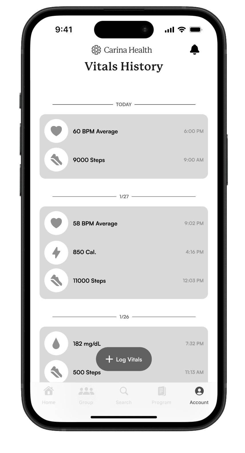
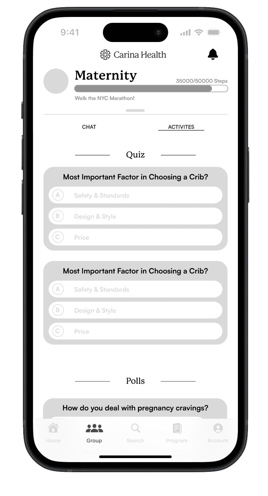
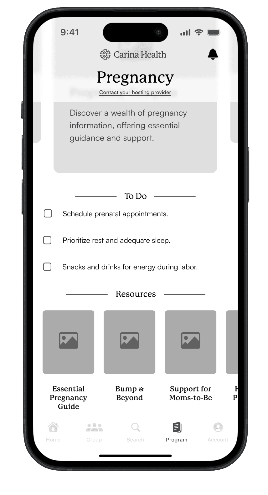
Multiple rounds of low-fidelity screens were created to visually conceptualize the prioritized features, subsequently refining them into mid-fidelity screens.
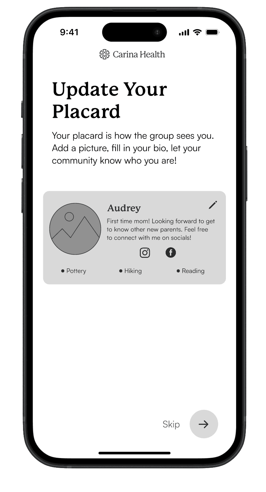
Onboarding
Update Card
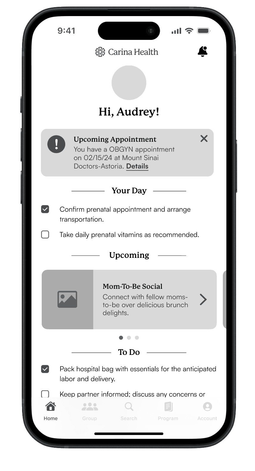
Home
Feed
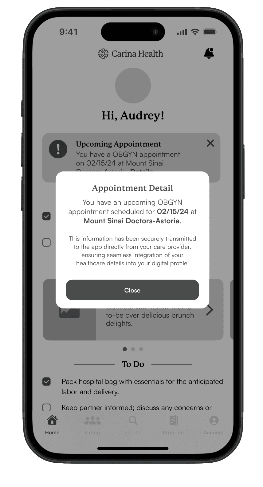
Home
Appointment
Programs
Carousel
Programs
Resources
Chat
Group Chat
Chat
Badge Animation
Vitals
History
Activities
Detail
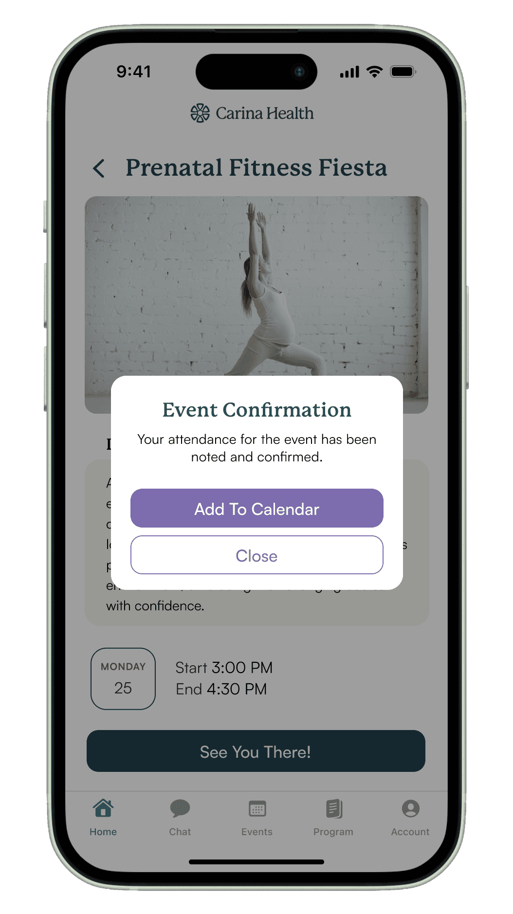
Hi-Fidelity Wireframes
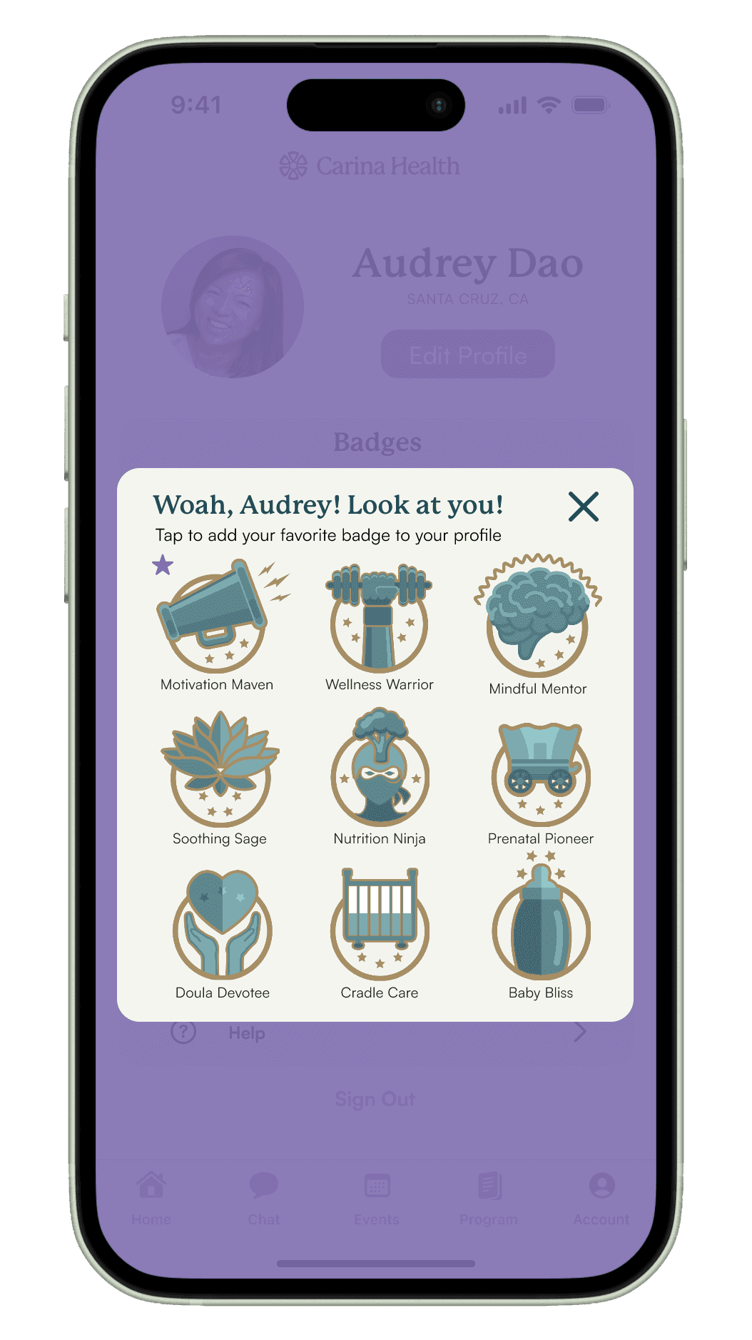
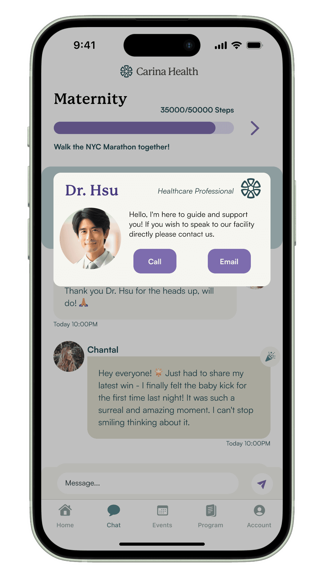
Multiple iterations of high-fidelity screens were developed to meticulously visualize the prioritized features, which were then progressively refined into a working prototype.
Home
Feed
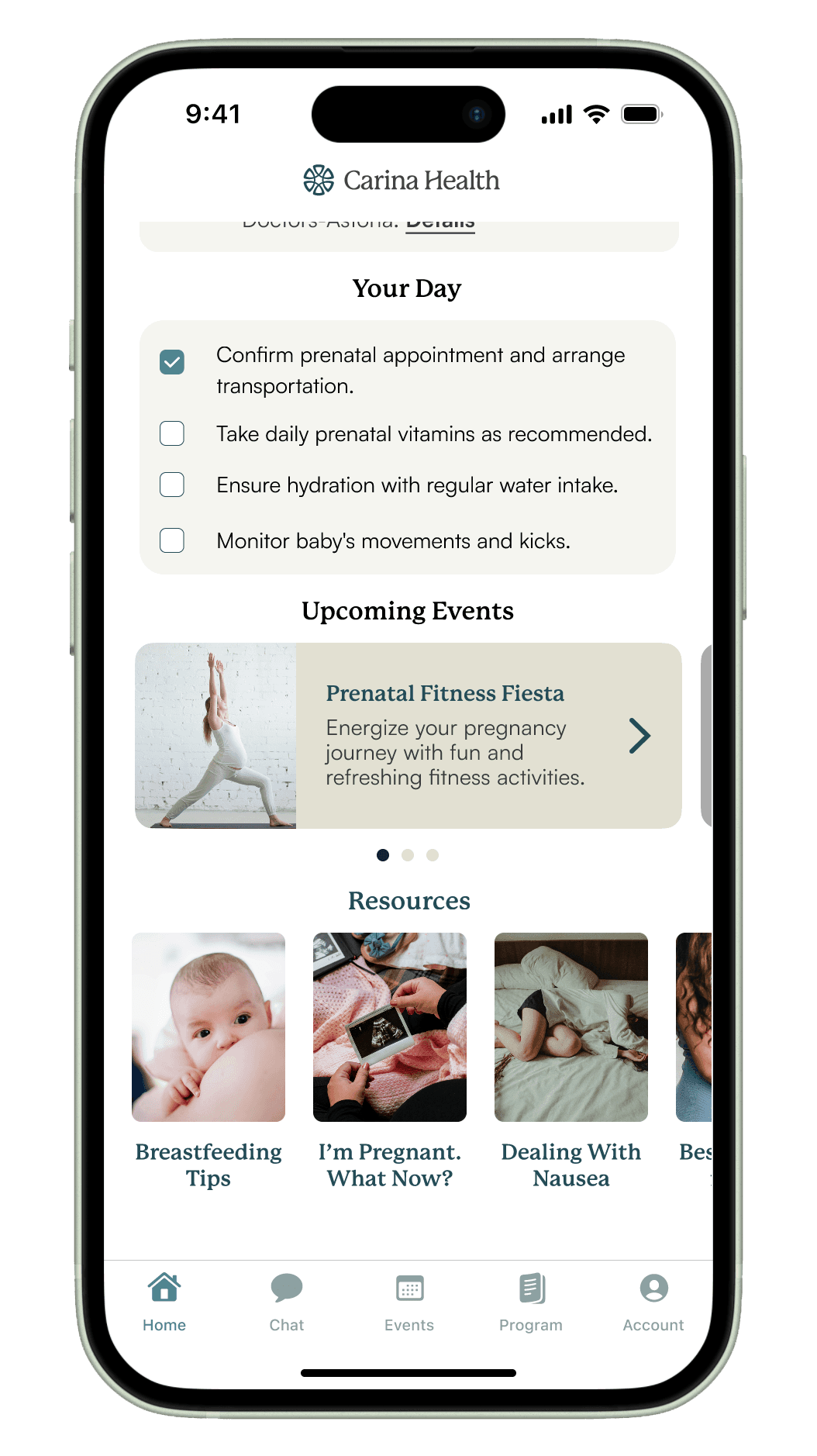
Events
Accoridion

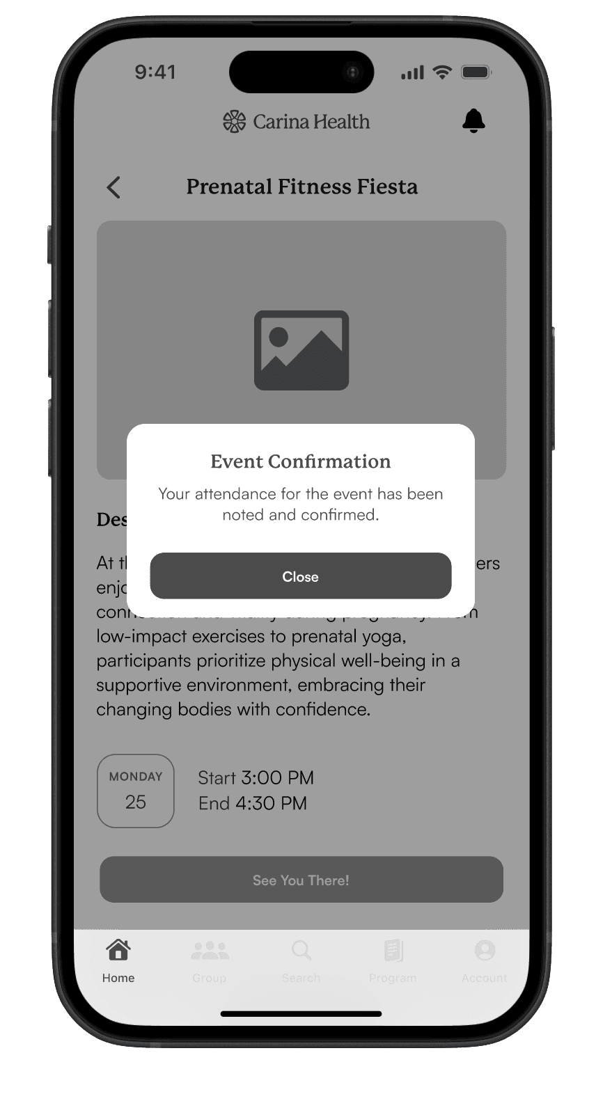
Events
Pop-Up

Chat
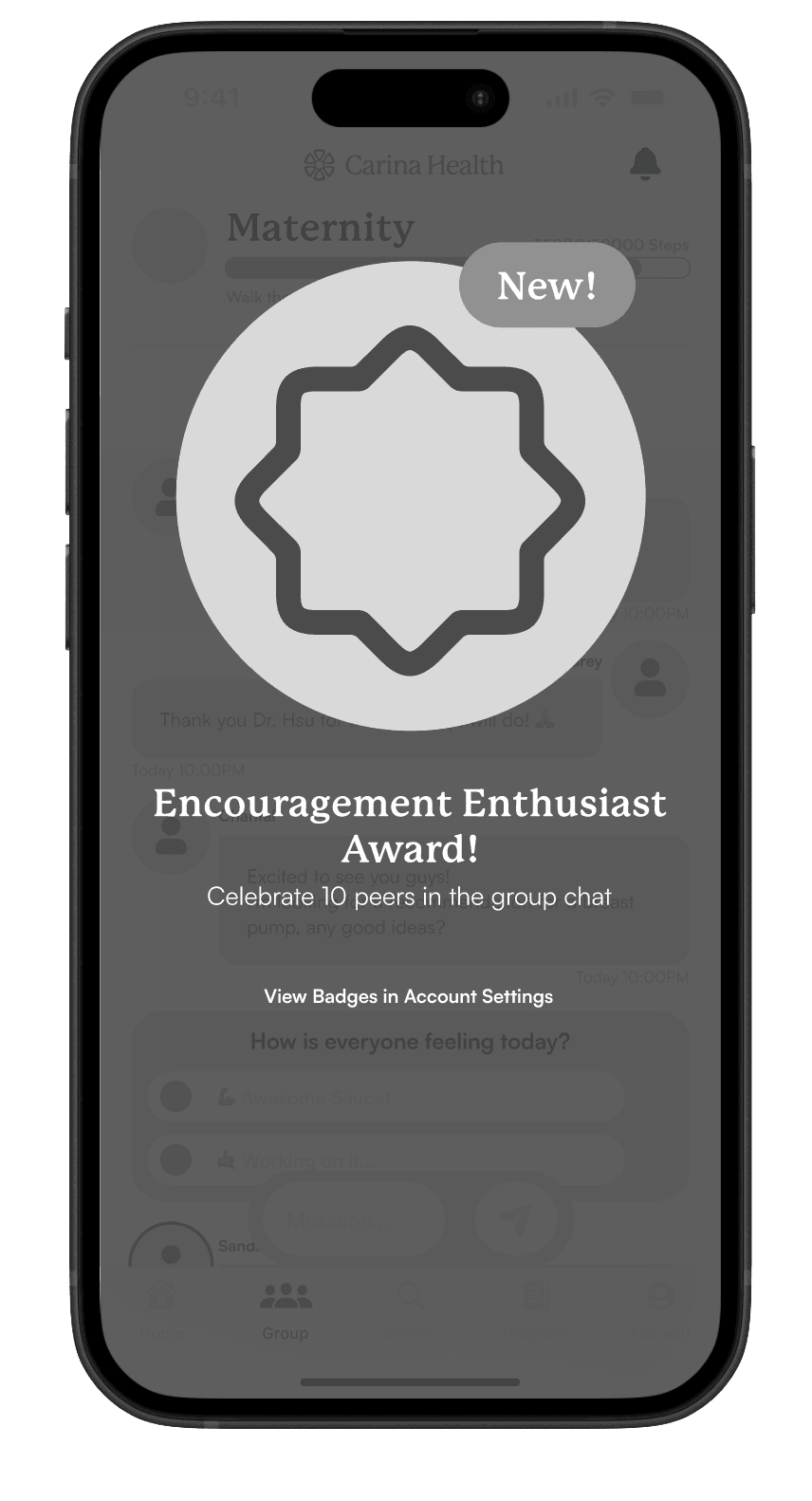
Badge Animation

Account
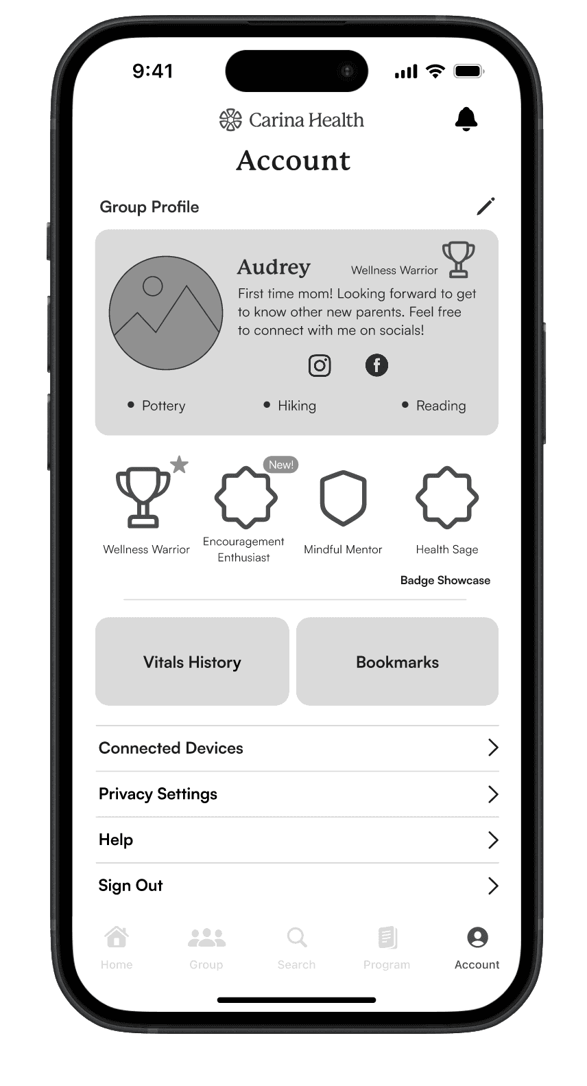
Detail
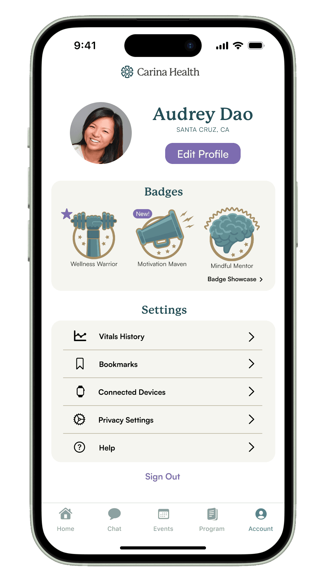
Account
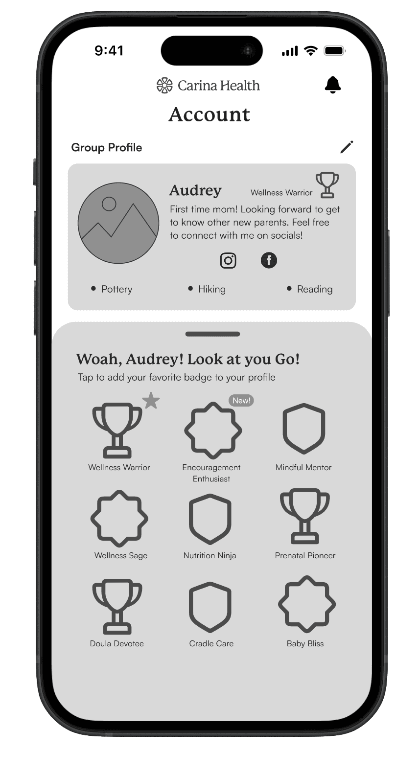
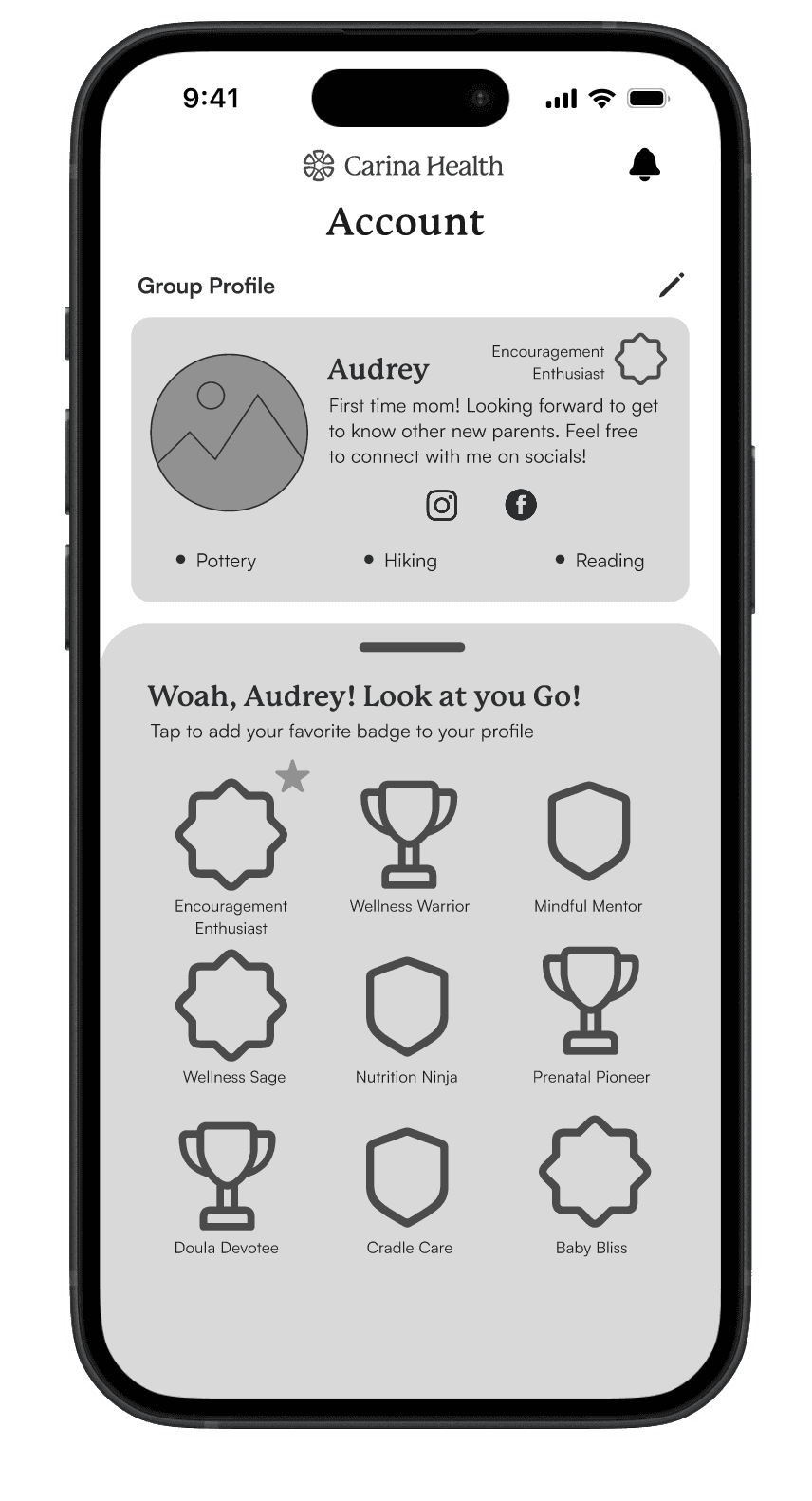
Badge Drawer

Chat
Profile Card

Chat
Poll Results

Chat
Provider Card
Usability Testing
In response to the test results from round one, changes were made to the mid-fi screens, and hi-fidelity screens were subsequently created for further refinement.


50%
Increase in Success Rate.
80%
Total Task
Success Rate.
Round 1 Changes:
Changed the wording from “Upcoming” to “Upcoming Events”.
Enlarged RSVP CTA
Created a dedicated “Events” app section.


20%
Increase in Success Rate.
50%
Total Task
Success Rate.
Round 1 Changes:
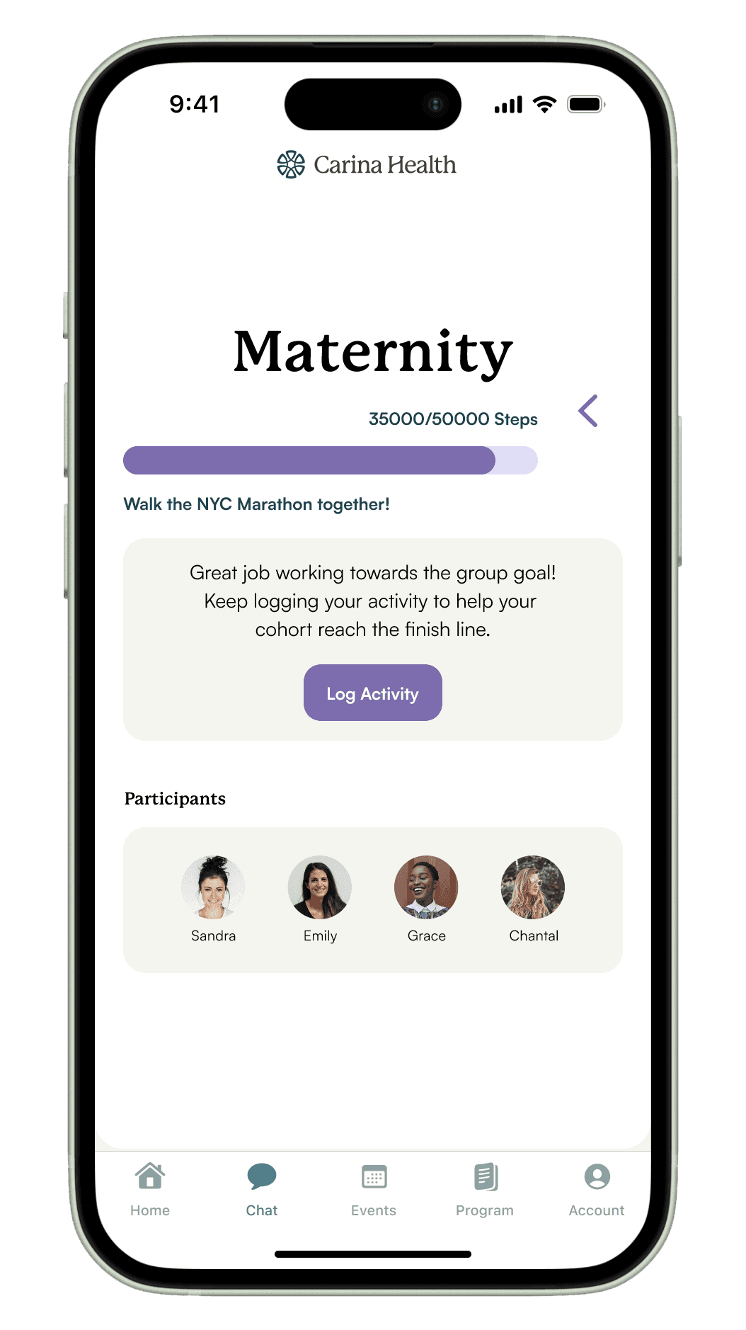
Enlarged Group Goal progress bar.
Added iconography to indicate text responses.
Converted Group Goal details drawer to more accessible page.
30%
Increase in Success Rate.
80%
Total Task
Success Rate.
Round 1 Changes:
Contact Provider enlarged CTA.
Resources put into grid format for easy scanning.
Resources added to Home activity feed.
Upon completion of the 3-week sprint, Carina Health received a comprehensive package of assets, including Figma files, a style guide, a specification document, a project report, and a presentation deck. These resources collectively encapsulate the design process and outcomes, providing detailed insights into the UI/UX design, technical specifications, project methodology, and key findings from usability testing.
The Figma files offer a visual representation of the design elements and components, while the style guide ensures consistency in visual elements across the platform. The specification document outlines technical requirements for development, and the project report summarizes the sprint's goals, achievements, and recommendations. Finally, the presentation deck serves as a tool for effectively communicating the design concepts and outcomes to stakeholders.
Final Thoughts
Throughout this project, I've gained profound insights into the significance of group care and its potential to positively impact individuals in need of guidance and support. This product has the capacity to serve as a vital hub for individuals navigating similar circumstances, offering a platform for communication and connection with others facing similar challenges.
The accessibility of provider care at one's fingertips can alleviate feelings of isolation and fear often associated with stressful medical situations. By providing a sense of community and readily available support, this product has the potential to make a meaningful difference in the lives of those in need, underscoring the importance of holistic care and support systems in healthcare solutions.
Organizing Insights
Affinity mapping was used to summarize what was learned from user interviews into key points.
Hypothesis
Through exploration, it was found that individuals in group treatment programs require a platform that enables them to monitor and organize treatment objectives, exchange peer support, and sustain motivation throughout their health journey.
What Was Believed…
Research Methods
To help shed light on these problems the following research techniques were used which served as fundamental tools utilized to gather insights, understand user needs, and inform design decisions.
Screener Survey
Employed surveys to pinpoint ideal interview candidates, ensuring tailored insights for informed design decisions.
User Interviews
Conducted user interviews to understand needs, gather insights, and inform design decisions.
Feature Analysis
Utilized benchmark data to analyze the competitive landscape, enabling us to differentiate their platform.
Group Care
Enjoy open chat within health group communities while ensuring all shared resources originate from reliable sources or healthcare professionals. This feature creates a safe environment for users to freely exchange information and experiences, promoting informed discussions and minimizing the risk of misinformation.
Carina Health sought expertise in addressing patient motivation challenges via their innovative platform that hoped to connect patients, providers, and peers.
The research with expecting parents informed key feature development for improved provider communication, peer connections, and engaging strategies.
These insights were utilized into the designs, prioritizing user-friendly design to maximize patient outcomes.


